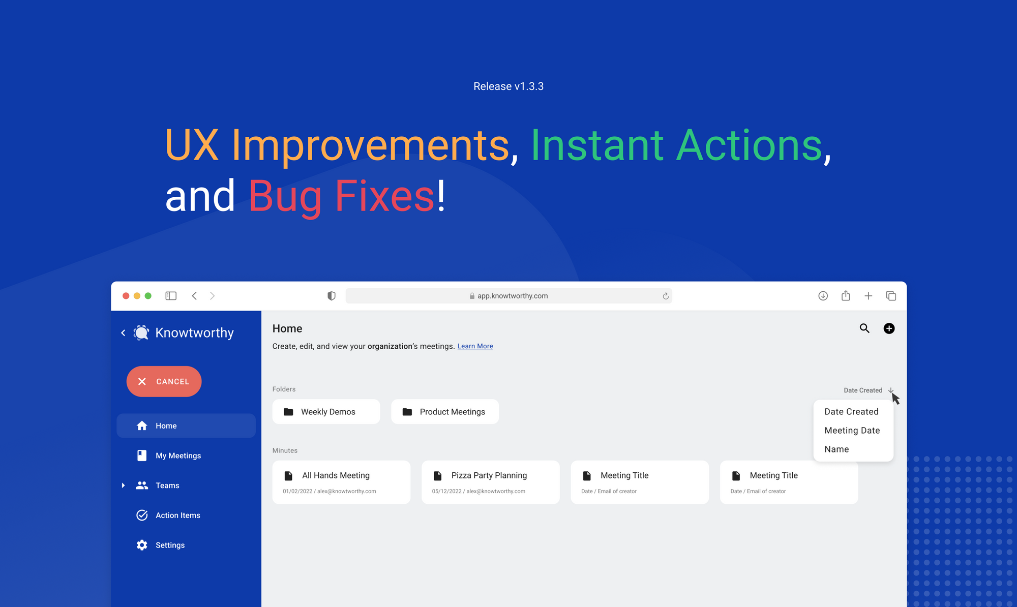
UX Improvements, Instant Actions, and Bug Fixes
In the last couple of weeks, we’ve been cooking up a big release full of requested UX improvements, some new features, and more!

In this update, we addressed a number of user experience optimizations and overall made the app easier to use, and reduced the learning curve to getting started. We also added some additional guide posts to our knowledgebase, and have linked them in the app to help you make the most of the app. Enjoy!
Changelog
New
- Users can now go from a team’s dashboard to “Manage Members” in settings, making it much quicker to add new people to a team.
- When adding a person to a team, the person will also automatically be added to the organization with “Viewer” permissions, meaning that you won’t need to go back and add them to the organization first.
- Users can now manage meeting participants directly from the “Share” popup within a meeting. This makes sharing the meeting with new people even quicker.
- Logged in users can now see a ‘Home’ button on their minutes document, allowing them to navigate back to their dashboard from a minutes document, so that you don’t need to switch tabs or in case you closed the home tab.
- Users can now manually remove real-time transcripts from their view in a minutes document and completely restart the transcription component. Though real-time transcripts are never saved, this gives some extra power to the user when choosing how to use transcription.
- A description and guide post was added to the “Home” page and “Team” dashboards: https://knowtworthy.com/guide/master-the-home-page/
- A description and guide post was added to the “My Meetings” page: https://knowtworthy.com/guide/how-to-use-the-my-meetings-page/
Improvements
- When downloading a PDF, the download button would not always open a new tab before downloading. Users should no longer lose the current page they are looking at when downloading a minutes document.
- Modifying or creating new agenda and action items now maintains a consistent height, making the experience a little more seamless.
- When creating a new team from the Home page, you will now see the team on the dashboard right away instead of needing to refresh.
- In some cases, users do not have permission to create new teams, we improved the error handling to make things more clear.
- Logged in users will now see a short explanation for why they cannot access transcription on a minutes document created in “My Meetings” to help reduce confusion about why transcription is available sometimes but now always.
- Numerous improvements were made to the navigation menu:
- The “Inbox” was renamed to “Action Items” to make it more clear what purpose that page served.
- A user’s context is now highlighted on the navigation menu, no matter where they are in the app. For example, if a user goes to “Settings”, the corresponding tab on the navigation menu will light up.
- A user can now see their username and current location at the bottom of the navigation menu when it is open. As a result, it is easier to see what context a user is operating in.
- Breadcrumbs showing where the user is on their dashboard have been moved to the bottom to make way for improved descriptions of the user’s current location on the top of the page.
- Text sizes and spacing was made more consistent and accurate on the home page and dashboards.
Fixes
- Patched an issue where some settings pages would display oddly on very large displays.
- Fixed an issue where users could not add additional accounts to an organization
- Fixed an edge case where if a user creates an account and drops off before choosing a plan, the app would appear blank if they tried to log in again. The user is now redirected to select another plan and complete their onboarding process.
In our next update, we’ll be adding support for additional profile customization as well as calendar integrations!
